ADVANCED TYPOGRAPHY - PROJECT 1 & 2
17/9/2018 - 1/10/2018 (Week 4 - Week 6 ) and 17/9/2018 - 1/10/2018 (Week 7 - Week 8 )
Ng Shu Zhi (0327158)
Typography - Project 1 & 2
LECTURE
Week 4: [Public Holiday]
Week 5: We had a lecture on the history of typography and 5 design influencers
Week 6: We had 2 lectures; Thinking before drawing and Type anatomy
Week 5: We had a lecture on the history of typography and 5 design influencers
Week 6: We had 2 lectures; Thinking before drawing and Type anatomy
Week 7: We had a lecture on Type Design Methodology where we presented about Glyphs, Kerning and Special characters.
Week 8: [Tutorial]
INSTRUCTIONS
WORK

fig 3.1 A picture I took of my lips for this project

fig 3.2 Since the topic was typosexual so obviously the first idea that came to my mind was to find an image related to more sensual themes.

fig 3.3

fig 3.4 Another design using the function of the lips which is yelling.

fig 3.5 Experimenting with the use of the lips, this one I experimented with the idea of biting like those lip stick advertisements where they would bit eon the tube of lipstick.

fig 3.6 Then exploring the use of a mouth again which is yelling but this time after confirming with the teachers about distorting the text.

fig 3.7 Exploring again another biting idea but this time only having it inside the mouth like it's biting down on the words Typosexual.

fig3.8 Another exploration done in Ai where I tried what the tutors asked me to try to follow the shape of the lip then I added the outline of the lips and text to follow the outline of the lip.

fig 3.9 Experimenting on the placement where I combined the idea of the text inside and outside the mouth then I was told my typeface of choice wasn't very good

fig 3.10 Experimenting after a friend advised that I could try to have the text go into the mouth

fig 3.11 Another experimentation

fig 3.12 Another experimentation

fig 3.13 Another experimentation

fig 3.14 This one was edited by the teacher when he was explaining to me to have the design captivate the audience by having them look within the artwork and making it look balanced
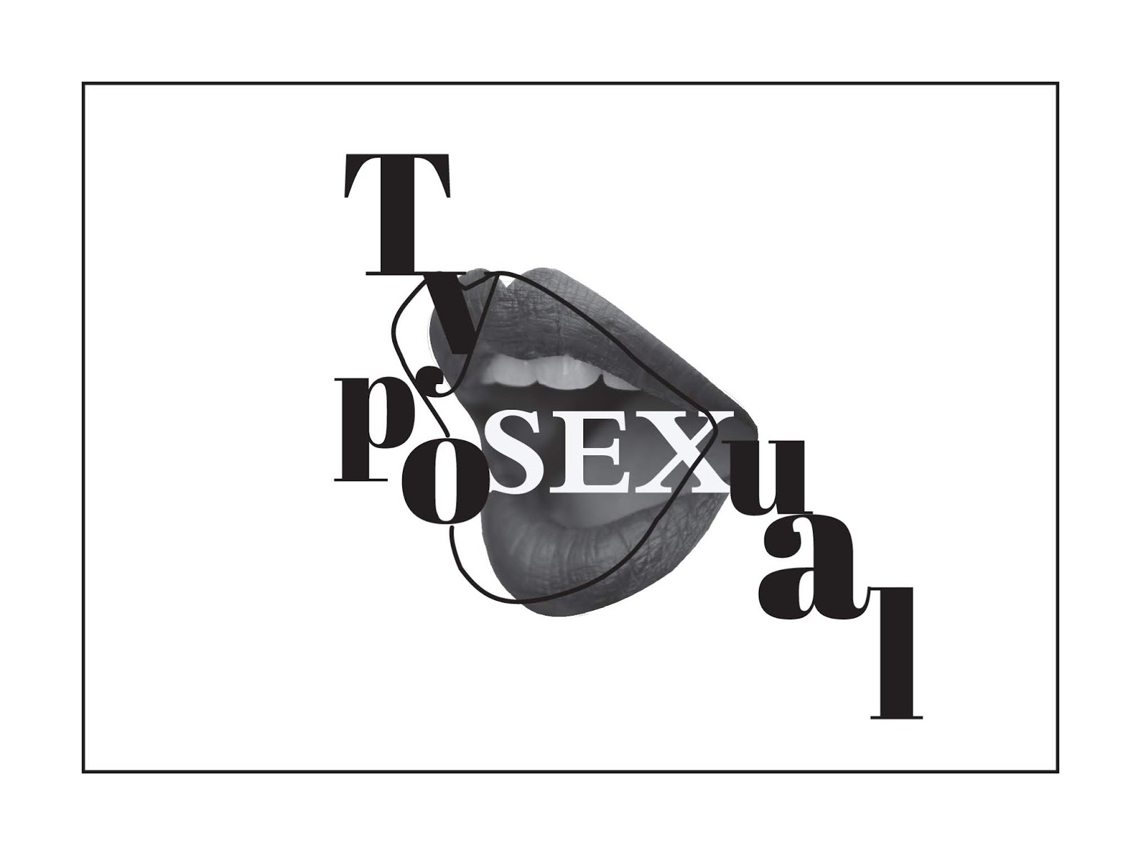
fig 3.15 I tried to do something that might balance the design by having a cascading effect for the letters "U,A and L" but then it didn't really balance it because of the placement.

fig 3.16 The final design for the logo where I took Mr.Vinod's advice to make the lip outline a heart to show the intimacy between designers and type even better. Then the letters were placed around the lip to have people's eyes follow the text.
PROJECT 2
Then with the approval of my key artwork, we began on project 2 where we start on designing out collateral, beginning with the posters

fig 3.1

fig 3.2

fig 3.3
I then realised I made many mistakes regarding sizing and tried more exploration with designs.

fig 3.4 The design I first made after looking at Vogue magazines and they had this overlapping effect to them so I tried to imitate it on the poster

fig 3.5 The final outcome for the design, I followed the vogue/retro idea which my friend gave me while making the key artwork.

fig 3.6 The final outcome together with colour. I used back the original colour in the picture since it was a reddish colour which was already planned since the beginning to represent intimacy.

fig 3.7 Unfortunately my laptop had some technical issue and my files weren't properly saved hence I do not have the progress to the final product but here are some of the sketches done in place of the missing progress.

fig 3.8 I felt like with the circular nature to the design, a badge would be a better choice to frame the key artwork and still keep the viewer's eye in the flow of the artwork.

fig 3.9 As for badges as the collateral, we were asked to make 4 designs, this is one of the 4 designs made for the badges collateral

fig 3.10 one of the 4 designs made for the badges collateral

fig 3.11 one of the 4 designs made for the badges collateral

fig 3.12 one of the 4 designs made for the badges collateral

fig 3.13 The microsite made as the second collateral for the typographic exhibition


fig 3.14 The html coding for the microsite
FEEDBACK
Week 4: General feedback: Putting images is important in helping the audience understand, put time periods, we should stand up while giving presentations, collaborate with each other and help each other during the presentation instead of just do our parts, and understand and explain our parts. Specific feedback: My letters need more character in them as now they are only lines without refining them and for exercise pt2. I should have the typographic design compliment the image and work together to make it look like a good typographic piece.
Week 5: General Feedback: To have a good presentation, we have to be engaging to the audience and to get people to pay attention, we can always ask them questions. For project 1, we were to focus on the intimacy between designers and typography through our key artwork and the title "Typosexual". Specific feedback: My image used was okay but the typography wasn't placed very nicely for typography so I were to experiment a bit on different methods to place the title "Typosexual" better.
Week 6: General feedback: For the presentation, Mr Vinod said it would've been great to include some examples of softwares which could use what we presented in our slides. It was important to have eye contact during the presentation. Specific feedback: My script typeface used for the design didn't compliment the key artwork so then it was changed to a retro style serif typeface after getting advice from my friend. The placement of the text also wasn't very balanced so then I changed the placement to wrap around the key artwork after some advice from the tutors.
Week 7: General feedback: For the presentation, Mr Vinod said it would've been great to include some examples of softwares which could use what we presented in our slides. It was important to have eye contact during the presentation. Specific feedback: My script typeface used for the design didn't compliment the key artwork so then it was changed to a retro style serif typeface after getting advice from my friend. The placement of the text also wasn't very balanced so then I changed the placement to wrap around the key artwork after some advice from the tutors.
Week 8: General feedback: The feedback between sudent and teacher is important for both parties to do their part to be able to get feedback and improve the designs. We should also try to combine the typographic systems for this project. Specific Feedback: It was important for me to place my key artwork at a strategic location then only add extra information around it. Extra graphic elemetns also can't distract the eye from the key artwork and readability is important.
REFLECTION
Experience
Week 4: After getting feedback it became much easier to fix my work as I know what is needed but I had to find more interesting pictures and the ones I own aren't interesting enough for this exercise as most of them have no movement visuals.
Week 5: Getting the image for the key artwork was harder then I thought as the lighting had to be good together with the angle. Then experimenting on
Week 7: For this week, I had tried many different variations of placement of the letters to get a well balanced piece where the eye of the viewer can travel around the artwork.
Week 8: For this week it was a bit difficult to make a poster as I've come to realise my key artwork wasn't very dynamic so it made designing a poster harder as the key artwork revolved around itself, adding external information that still complimented the key artwork was hard.
Observation
Week 4: My designs didn't match the key artwork very well so I had to refer to my friends' blogs to remake the designs.
Week 5: I had to test out many different variations of designs and combine many designs I had before to get something satisfactory.
Week 7: It is important to use surrounding ideas to relate back to the key artwork's purpose, then it will be easier to make ideas.
Week 8: My computer ran out of space so any file I thought I had saved didn't actually save so in the end I ended up with a blank file with no designs in it. So backing up work is very important.
Findings
Week 4: I have to be able to pair the text together with the key artwork together nicely to have them compliment each other.
Week 5: Trying out many different methods while thinking about the possibilities of using the key artwork's nature is also helpful in designing something.
Week 6: It is important to test out many ideas to see which idea would be suitable for the key artwork, but also keeping in mind about balance, and the audience's eye movement in the piece.
Week 7: It is important to test out many ideas to see which idea would be suitable for the key artwork, but also keeping in mind about balance, and the audience's eye movement in the piece.
Week 8: Firstly I learned the importance of having a hard drive and backing up files as my files weren't saved properly hence my final file was blank. Then placing the key artwork then only the extra details were important in making a design.
FURTHER READING
Week 4

fig 6.1 an example I found interesting online where I liked the overlapping design for some of the text and image

fig 6.2 Another example

fig 6.3 Another example but this time it's the text forming a shape which was where I got my idea for the earlier design with the text in the shape of the lip
Week 5

fig 6.4 an example of what I thought about for the biting on a tube of lipstick but I changed the tube into the word Typosexual.
Week 6

fig 6.1 Design Style: Retro
In this article I learned about the retro style with it being:
-Vintage
-Mid-century
-Shabby-chic
Retro is a more livelier look as it was after WW2 but design companies had to pick up from the 40s but with these new designs to look happier as they have ended the war. Explaining the lively, rounded exaggerated and contrasting styles.

fig 6.2 Examples of retro typefaces.

fig 6.1 one of the inspiration for the retro designs at the beginning of the project where I noticed a more grid / modular based system which didn't interfere with other elements in the design.

fig 6.2 another inspiration for the retro designs at the beginning of the project

fig 6.3 another inspiration

fig 6.4 another inspirtation

fig 6.5 Inspiration for the vogue magazine, overlapping idea seen in later designs.


Comments
Post a Comment