ADVANCED TYPOGRAPHY - FINAL PROJECT
29/10/2018 - 19/11/2018 (Week 10 - Week 13 )
Ng Shu Zhi (0327158)
Advanced Typography - Final Project - Design, Exploration and Application
INSTRUCTIONS
WORK
As for my final project I would focus on a life long dream I've had since I was a child. Changing the skittles font. As a child I never likes the font for these few reasons:
1. It's blocky shape doesn't represent skittles which are round and smooth.
2. It's colour doesn't represent skittles or the exciting flavours in skittles.
3. It's kerning is too tight when skittles are individual bite sized candy.
Ways to solve this:
1. Make the font more expressive to the flavours
2. Fix the Kerning to match Skittle's nature of being bite sized candy.
So after discussing with the teachers, they referred to me a Malaysian artist Yusof Gajah's work and recommended I use the fruit flavours in the original skittles to narrow down my options of fruits to use.

fig 2.1 I made some sketches after searching up different ways to use fruit artistically and I ended up with 2 iterations where the first one is each letter being a single fruit and made from carving, twisting and slicing while the second one is more simple to make but each letter is made from more than one fruit.
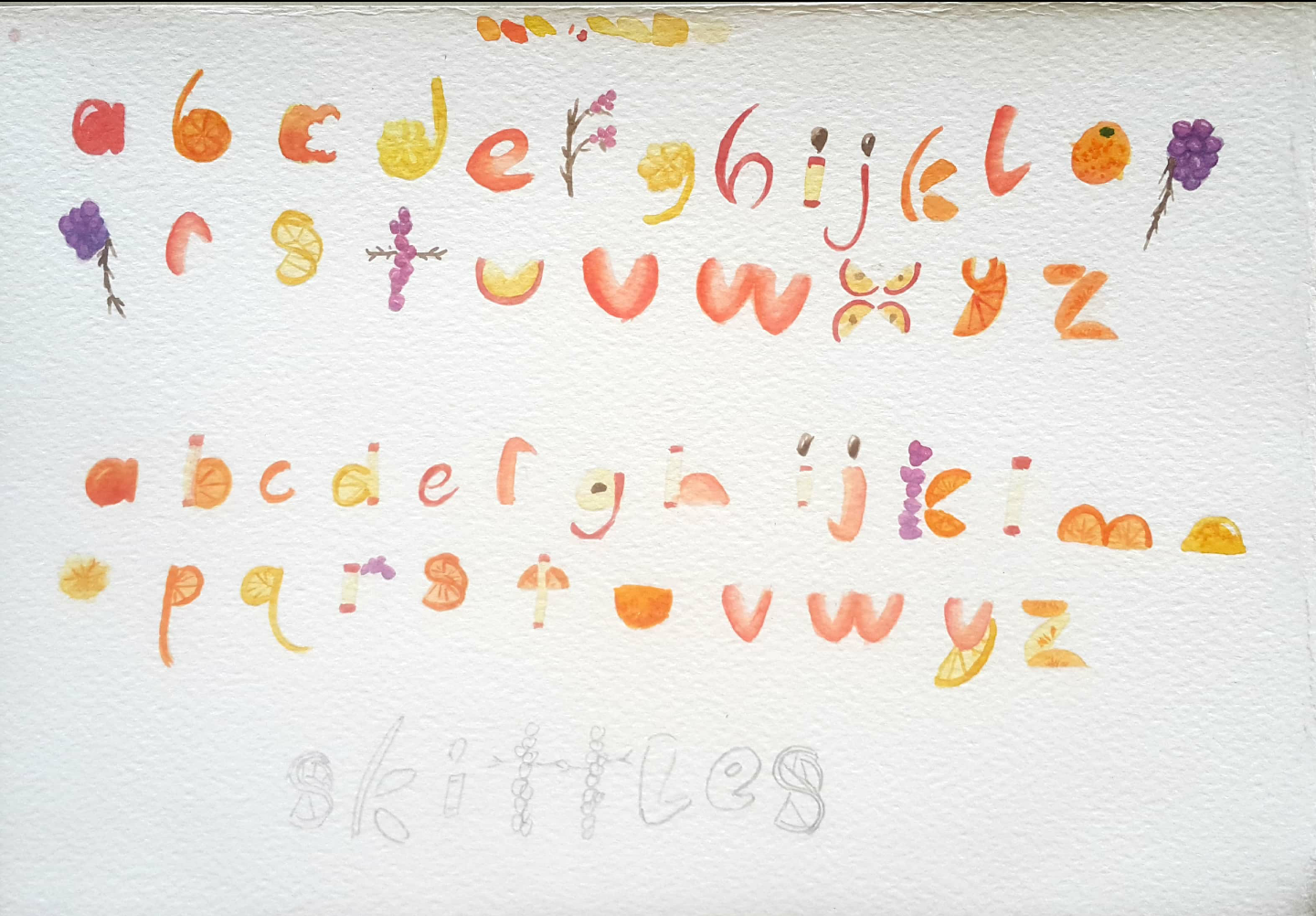
fig 2.2 I painted the colours of the letters to be able to differenciate the fruits used for each letter.

fig 2.3 The fonts done in AI for me to convert to font lab

fig 2.4 The letters put into font lab to test them out.

fig 2. 5 Static image of the Skittles poster

fig 2.6 An animation for the poster

fig 2.7 The new design after the lecturers had pointed out my mistake for the fruit font to be a display font for skittles and not replace the skittles font itself.

fig 2.8 The gif for the new poster design
FEEDBACK
Week 10:
Specific feedback: The lecturers were okay with my idea to improve the skittles font but they advised me to use the flavours of the skittles to have specific kinds of fruit to focus on designing. They also referred to me a Malaysian artist who made alphabets out of elephants and that helped me out a lot with the type of letters to create.
Week 11:
[holiday]
Week 12:
Specific Feedback: My idea and sketches were interesting to the lecturers and they advised me to carve out the letters in real fruit with the use of my sketches then in my final, have a short clip morphing the image into the graphic.
Specific Feedback: Mr Vinod asked for me to make a poster for the new Skittles font I've designed as a display font and animate the poster with the new font. The point of the poster is to promote the fruity flavour of skittles to co-relate with the new font.
REFLECTION
Experience
Week 10:
I can finally channel my lifelong hate for the skittles font from my childhood. It always irked me since the first time I saw the packaging. Then the teachers giving me advise on using the fruit flavours to make the letters made this project more interesting because my first intent was just to make the font rounder and add some colours so it would suit the bursting flavours of skittles but the fruit idea just gives a better representation of skittles.
Week 11:
Searching for different carving methods had peaked m interest in this project as I had a specific type of carving method I would've wanted to use where I can use different parts of a fruit to make a letter instead of just carving a hole in the fruit and calling it a day.
Week 12:
I tried to carve the fruit according to my sketches and it proved to be harder than I thought and I had to make some amendments from the original sketch to cater to my level of fruit carving skills.
Week 13:
It took awhile to think of a design for the new skittles font because Skittle's tagline is "Taste the rainbow" and the designs I looked up usually consisted of a rainbow theme but my design has to do with the fruity flavour within Skittles.
Observation
Week 10:
My childhood dreams to change the skittles font have come true. Being an adult is great.
Week 11:
Finding different ways to make fruit art is interesting as I'm not familiar with food art, I just eat everything.
Week 12:
Fruit carving is very messy and difficult so I changed some of the designs to cater to my bad carving skills.
Week 13:
It was hard to find reference images for Skittles posters because the posters usually consisted themes for the "Taste the rainbow" tagline which usually only consisted of a rainbow or the skittles themselves so I opted to look at tropical designs.
Findings
Week 10:
Having a lifelong hate for something pays off sometimes like my passionate hate for the skittles font since a young age gave me the inspiration and drive to start this project.
Week 11:
Looking for different fruit carving methods was interesting. I mostly found oranges because I think it's because carving oranges is part of a culture thus the increased amount of orange art. The best one to find out was the orange slice twists.
Week 12:
Carving fruit isn't as easy as I thought and now I see why the lecturers advised me if I could have a culinary friend help me with this project but I didn't have any friends from culinary arts so I had to carve the fruit myself which resulted in not the best outcomes.
Week 13:
Looking around at what I'm familiar with which are tropical designs have come in handy in this project because I'm working with fruit which is something that's supposed to be refreshing. Since it's also fruit and my proposed outcome is for the font to come out looking a bit more playful, looking at flat lays for children videos and
FURTHER READING
Week 12

fig 5.1 I search and found these twisted orange slices and the last one resembled an S

fig 5.2 peeling the fruit half way

fig 5.3 Cut out of strawberries to make swan heads seemed like it could make many possibilities for making letters.

fig 5.4 Thinly sliced apples and apple skin also gave me many ideas because of it's flexibility.

fig 5.5 Canadian Living: How to make a fancy double Orange twist Garnish
Since my project involves fruits and I don't know how to cut fruits in a more visually pleasing manner, I went to search how to cut an orange garnish for my 'S' because that seemed to be not as straight forward as just peeling and cutting a fruit.
Week 13

fig 5.6 a skittles poster taking a different approach to their tagline "Taste the rainbow"

fig 5.7 another skittles poster which uses the skittles candy themselves and another rainbow

fig 5.8 Using the skittles candy to show taste the rainbow.

fig 5.9 So with the thought that Skittles poster designs make use of the rainbow, I chose to use the fruits in a tropical way so I went to find some graphics for an idol group's song whose theme had a more tropical vibe.

fig 5.10 children flat lay style, it looks lively with the colours being pastel so they're not too harsh on the eyes. The style of the illustrations are more simpler, with no outlines.


Comments
Post a Comment